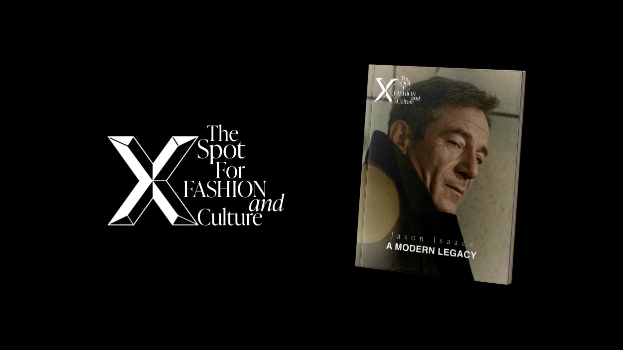
Xmag unveils a refined identity, placing the X at its core as a symbol of connection, culture and modern luxury.
In an industry where image is everything, evolution is not just expected — it is essential. At Xmag, that evolution has taken a decisive, almost inevitable form: the elevation of a single, powerful symbol. The X.
For years, the publication has been widely associated with the idea of “X magazine”. A natural interpretation, and one that reflects its presence within contemporary culture. Yet behind that perception, there has always been a deeper, more intentional concept — one that now steps forward with clarity and purpose.
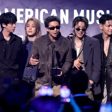
The X has never been a decorative element. It has always been the essence. In its most immediate reading, the X carries a softness that contrasts with its graphic strength. In English, it signifies a kiss — a gesture of affection, intimacy, and human connection. In the context of fashion, this meaning resonates instinctively. The industry thrives on encounters: backstage greetings, front-row reunions, fleeting conversations at events where a kiss becomes a universal language. A subtle ritual that transcends borders, status, and identity.
But the symbolism goes further. The X is also a mark — a point of convergence. A place where paths cross. And that is precisely where Xmag exists: at the intersection of fashion and culture. Not as separate disciplines, but as a shared space where aesthetics, ideas, and people meet.
This idea now finds a clear verbal expression through the introduction of a new slogan: The Spot for FASHION and Culture. More than a tagline, it encapsulates the very essence of the X — that precise point where fashion and culture converge. It is a phrase that will begin to appear consistently across platforms, reinforcing the identity and sharpening the message behind the symbol.
This redefined identity does not erase the name. The publication remains Xmag, and will continue to be recognised as such. What changes is the emphasis. The X is no longer part of the brand — it is the brand’s defining force.
The transition is already underway. Across digital platforms, the new visual language is being introduced with intention and restraint. The X appears not as a replacement, but as a constant — a symbol that anchors the magazine’s presence while allowing flexibility in its editorial expression.
Print will follow, gradually. In Xmag UK, the shift will become visible first, positioning the edition at the forefront of this new era. Spain will adopt the change more progressively, with a full transition expected towards the end of the year. It is a considered rollout, aligned with the publication’s commitment to coherence across markets.
For Ignacio Ferreyra, global director of Xmag, the decision is both strategic and deeply personal. “The X has always been the goal of the magazine since its creation. It was part of the series that introduced me to fashion — Gossip Girl — and now it feels essential to give it the place and meaning it deserves.”
The reference is telling. In a world shaped by cultural moments and visual codes, symbols carry memory. They evolve, but they remain anchored in the emotions that first defined them.
With this shift, Xmag does not simply redesign its identity — it refines its narrative. The X becomes a statement of intent: precise, recognisable, and open to interpretation. A symbol that embraces both intimacy and structure, emotion and direction.
In a landscape saturated with logos, reducing a brand to a single letter is not a simplification. It is a declaration of confidence.
And in this case, a reminder that sometimes, the most powerful way to move forward is to return to the origin — and finally give it the space it always deserved.